Plain walls often feel unfinished because they lack depth, softness, and material contrast. Fabric and textured wall décor solves this by adding warmth, tactile interest, and a more layered visual feel without requiring heavy furniture or structural wall changes.
This approach is especially useful in:
- living rooms with large blank walls
- bedrooms that need softness
- hallways that feel flat
- home offices with echo
- dining areas that need warmth
- apartments with minimal built-in character
The biggest advantage of fabric and textured wall décor is that it changes how the wall looks and feels at the same time. Unlike flat framed art, textiles add dimension through weave, folds, raised surfaces, and natural fibers.
Useful texture options include:
- woven tapestries
- macramé wall hangings
- linen fabric panels
- upholstered wall sections
- jute or cane texture pieces
- velvet acoustic panels
- framed textile art
These materials help the wall:
- feel warmer
- reduce harsh flatness
- soften echo in larger rooms
- improve visual layering
- create a more premium atmosphere
This makes textured wall décor especially effective in modern, luxury, Scandinavian, boho, and minimal interiors where softness is needed to balance hard surfaces like paint, glass, stone, or wood.
The key is choosing the right material, wall scale, and room placement so the texture supports the space instead of overpowering it.
In this guide, you’ll learn practical ways to elevate your wall décor with fabric and textured elements, including room-based ideas, material selection, styling rules, and luxury finishing tips.
Why Fabric & Textured Wall Decor Works
Fabric and textured wall décor works because it solves one of the biggest wall design problems: flatness. Painted walls, even in premium colors, can still feel visually empty. Texture adds depth, softness, and material contrast, making the wall feel more intentional and comfortable.
1) It Adds Warmth and Softness
Hard wall surfaces like paint, stone, and glass can make a room feel cold.
Fabric elements help by adding:
- soft visual texture
- woven detail
- natural fibers
- layered folds
- handcrafted warmth
This is especially useful in bedrooms, living rooms, and hallways.
2) It Creates Visual Depth
Textured décor changes how light interacts with the wall.
Examples:
- woven threads create shadows
- raised panels add dimension
- velvet absorbs and softens light
- jute creates organic surface contrast
- pleated fabric adds movement
This makes the wall look more layered than flat artwork.
3) It Improves Acoustic Comfort
Fabric naturally helps soften sound.
This is highly useful in:
- home offices
- bedrooms
- TV lounges
- large living rooms
- dining rooms with echo
Useful textured solutions:
- upholstered panels
- velvet acoustic tiles
- thick woven hangings
- quilted textile panels
This improves comfort as well as style.
4) It Works Across Multiple Interior Styles
Fabric and texture are highly flexible.
Best style matches:
- linen and wool → Scandinavian and Japandi
- velvet panels → luxury and modern
- macramé and woven hangings → boho
- jute and cane → rustic organic
- neutral textile panels → minimal interiors
This makes textured wall décor a long-term styling solution.
5) It Softens Large Blank Walls
Large walls can often feel empty even with one artwork frame.
Textured wall décor works well for:
- above sofas
- behind beds
- hallway end walls
- dining feature walls
- staircase landings
Larger textile pieces fill the wall without making it visually hard.
6) It Pairs Well With Hard Materials
Texture works best when balanced with contrasting finishes.
Best combinations:
- fabric + wood
- linen + black metal
- velvet + brass
- jute + stone
- wool + glass
- woven cotton + mirrors
This contrast creates a more elevated wall design.
Fabric and textured wall décor works best because it improves depth, warmth, sound comfort, and material balance in one wall solution.
How to Choose the Right Fabric & Texture
The right fabric wall décor should match the room function, wall size, humidity level, and overall interior style. Choosing the wrong material or scale can make the wall feel heavy, dusty, or visually disconnected.
Here are the most practical things users should consider.
1) Choose the Right Fabric Material
Different fabrics create different wall effects.
Best practical options:
- linen → best for minimal, Scandinavian, and soft luxury walls
- cotton → lightweight, easy for tapestries and framed textile art
- wool → ideal for warmth, woven texture, and acoustic softness
- jute → best for rustic and organic wall styling
- velvet → perfect for premium upholstered panels and acoustic walls
- cane or woven blends → useful for mixed-material textured displays
Choose heavier fabrics for statement walls and lighter fabrics for decorative hangings.
2) Match Texture to the Room Style
The wall texture should support the room’s design language.
Useful pairings:
- linen + oak wood → Japandi and Scandinavian
- velvet + brass accents → luxury bedrooms
- jute + cane → earthy organic interiors
- macramé cotton → boho and cozy corners
- neutral wool weave → modern minimal homes
This keeps the texture integrated with nearby furniture and lighting.
3) Choose the Right Size for the Wall
Scale matters more with fabric because soft textures visually spread wider.
Useful size rules:
- above sofa → 2/3 of sofa width
- behind bed → align with headboard width
- hallway wall → use tall vertical runner-style textiles
- entryway → centered above console width
- office backdrop → match desk width or slightly narrower
Oversized textile pieces work better than many small hanging items.
4) Consider Room Humidity and Maintenance
This is highly practical.
Avoid moisture-sensitive fabrics in:
- bathrooms
- damp kitchens
- non-ventilated corners
Best choices for humid spaces:
- acrylic woven blends
- treated cotton
- synthetic acoustic panels
- wipeable upholstered tiles
This improves durability.
5) Think About Wall Weight and Hanging Method
Heavier textile panels need stronger hanging support.
Useful options:
- rod-mounted tapestry
- hidden bracket panel
- framed textile art
- adhesive acoustic tiles
- hook-mounted woven hangings
Large velvet or quilted panels should not rely on weak adhesive alone.
6) Match Texture Intensity to Room Size
Too much heavy texture can overwhelm smaller rooms.
Useful guide:
- small room → linen, light cotton, slim woven panels
- large wall → layered tapestry or velvet panels
- echo-prone office → thicker acoustic texture
This keeps the room balanced.
Choosing the right fabric and texture helps the wall stay visually soft, easy to maintain, and fully aligned with the room’s function.
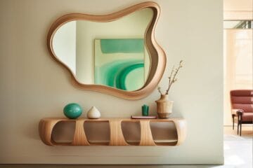
1. Oversized Woven Tapestry Above a Sofa
An oversized woven tapestry above a sofa is one of the most effective ways to make a living room wall feel warmer and more complete. Unlike flat artwork, the woven surface adds texture, softness, and visual depth while still acting as the main focal point.
This layout works especially well in:
- living rooms
- apartment lounges
- open-plan seating areas
- neutral minimal homes
- boho luxury spaces
Why This Layout Is Useful
The wall above a sofa is usually the largest visible blank wall. A woven tapestry fills that space without making the room feel hard or heavy.
This layout is useful because it:
- softens the seating wall
- adds texture without bulky furniture
- improves acoustic warmth
- works as a large focal piece
- reduces the flat look of painted walls
- pairs well with wood and fabric furniture
This is especially practical in homes with lots of hard surfaces.
Best Size Rule
A useful placement formula:
- tapestry width should be around 2/3 of sofa width
- hang it 6–8 inches above the sofa back
- keep the bottom edge clear of cushions
- use oversized vertical length for taller ceilings
This keeps the tapestry visually connected to the sofa.
Best Material Choices
Best useful woven options:
- wool weave
- cotton tapestry
- macramé blend
- jute weave
- linen thread weave
- mixed neutral fiber art
Choose medium to heavy texture for better depth.
Practical Styling Tip
Keep nearby décor simple so the tapestry remains the hero piece.
Best pairings:
- low side lamps
- textured cushions
- wood coffee table
- neutral throw blanket
- one tall floor plant
This keeps the wall balanced.
Lighting Tip
Use warm side lighting or natural window light angled across the tapestry.
This helps:
- highlight weave depth
- create shadow texture
- improve evening warmth
- make neutral fibers look richer
Texture becomes more visible when lit from the side.
Mistake to Avoid
Avoid using a tapestry that is too small for the sofa wall.
This can make the wall feel disconnected.
Instead:
- use one oversized piece
- avoid multiple tiny woven hangings
- keep the width proportional to seating
An oversized woven tapestry above a sofa is highly useful because it creates a soft focal wall that improves warmth, acoustics, and living room depth in one piece.
2. Macramé Wall Hanging for Bedroom Softness
A macramé wall hanging is one of the most practical ways to add softness to a bedroom wall because it introduces woven texture, calm movement, and a handmade warmth that works beautifully in resting spaces. It helps the room feel more relaxed without relying on multiple hard décor pieces.
This layout works especially well in:
- above the bed
- beside a vanity
- reading corners
- guest bedrooms
- small apartment bedrooms
- neutral boho interiors
Why This Layout Is Useful
Bedrooms benefit from soft surfaces that reduce visual sharpness. Macramé naturally adds that softness through knots, fringe, and woven patterns.
This layout is useful because it:
- softens the bed wall
- adds handcrafted texture
- pairs well with bedding fabrics
- supports a calm mood
- reduces the flat look of painted walls
- works well in small bedrooms
This is especially useful where the room lacks upholstered furniture.
Best Placement Rule
The most practical placement is centered above the headboard.
Useful size guide:
- width should be 50–70% of headboard width
- hang 6–8 inches above the bed
- keep fringe clear of pillows
- use longer vertical hangings for tall ceilings
This keeps the wall balanced.
Best Material Choices
Best useful macramé options:
- natural cotton rope
- off-white braided cotton
- jute-blend macramé
- wool fringe weave
- wooden dowel top rod
Neutral fibers work best in bedrooms because they feel calmer.
Practical Styling Tip
Pair the hanging with soft materials nearby.
Best pairings:
- linen bedding
- woven throw blanket
- wood bedside tables
- ceramic lamps
- neutral rugs
- cane headboard
This creates a cohesive soft-texture bedroom.
Lighting Tip
Warm bedside lamps make the knots and fringe more visible.
Best lighting sources:
- wall sconces
- table lamps
- soft pendant glow
- natural morning light from side windows
This highlights the handcrafted detail.
Mistake to Avoid
Avoid highly colorful or overly busy macramé patterns in small bedrooms.
This can make the room feel visually noisy.
Instead:
- choose neutral tones
- use one large hanging
- keep surrounding wall décor minimal
A macramé wall hanging is highly useful because it adds bedroom softness, handcrafted warmth, and vertical texture without making the wall feel heavy.
3. Framed Textile Art Panels
Framed textile art panels are one of the most refined ways to add fabric texture to a wall while keeping the look structured and premium. By framing fabric, woven pieces, or handcrafted textiles, the wall gets softness, depth, and a gallery-like finish without the loose look of hanging fabric.
This layout works especially well in:
- living room feature walls
- bedroom dresser walls
- hallway galleries
- dining room sideboards
- home office backdrops
- luxury entryways
Why This Layout Is Useful
Loose fabric works well for casual spaces, but framed textile art gives the wall more definition.
This layout is useful because it:
- adds texture with clean edges
- protects delicate textiles from dust
- turns fabric into art
- works in formal interiors
- supports gallery wall styling
- blends well with mirrors and lighting
This is especially useful for minimal and luxury interiors.
Best Placement Rule
Useful size guide:
- above console or dresser → 2/3 of furniture width
- hallway walls → use vertical narrow framed panels
- sideboard walls → pair 2 or 3 equal panels
- office backdrop → center with desk width
Hang framed textile panels at eye level for best impact.
Best Textile Choices
Best useful fabric options:
- linen weave
- handwoven cotton
- embroidered textile
- block-print fabric
- vintage scarves
- silk texture panels
- wool weave art
- quilt fragments
Choose fabrics with visible texture rather than only print.
Practical Styling Tip
Use frame finishes that connect with nearby materials.
Best pairings:
- oak frames with wood furniture
- black frames with metal accents
- brass trim with luxury consoles
- white frames for Scandinavian walls
The frame should support the textile, not overpower it.
Useful Layout Formula
A strong practical formula:
- one oversized center panel
- two symmetrical vertical side panels
- three equal frames above a console
This keeps the wall visually organized.
Mistake to Avoid
Avoid overly glossy glass if the wall receives direct window glare.
This can hide the textile depth.
Instead:
- use anti-reflective glass
- use open shadow-box frames
- choose side lighting for better texture visibility
Framed textile art panels are highly useful because they combine fabric softness with the clean structure of wall art, making textured walls look polished and intentional.
4. Upholstered Wall Panels for Luxury Bedrooms
Upholstered wall panels are one of the most effective ways to add both texture and functional comfort to a bedroom wall. Unlike decorative hangings, these panels create a padded surface that improves softness, sound absorption, and a premium hotel-like look.
This layout works especially well in:
- behind the bed
- full headboard walls
- side reading corners
- dressing room walls
- luxury guest bedrooms
- apartment master bedrooms
Why This Layout Is Useful
Bedrooms benefit from soft vertical surfaces, especially around the bed zone.
This layout is useful because it:
- creates a soft backdrop for the bed
- improves acoustic comfort
- reduces wall echo
- adds insulation against cold walls
- makes the room feel more premium
- protects the wall from scuffs near the headboard
This is especially practical in bedrooms with minimal furniture.
Best Placement Rule
The most useful placement is behind the headboard wall.
Useful size options:
- panel width should match full bed width
- extend 6–12 inches beyond the bed on each side
- full-height panels for dramatic ceilings
- half-height panels for subtle luxury
This keeps the wall aligned with the bed zone.
Best Fabric Choices
Best useful upholstery fabrics:
- velvet
- suede
- linen blend
- boucle
- quilted cotton
- acoustic felt fabric
For premium softness, velvet and boucle work best.
Practical Styling Tip
Use tonal layering with nearby fabrics.
Best pairings:
- upholstered bed
- linen bedding
- velvet cushions
- wood bedside tables
- brass sconces
- soft neutral curtains
This creates a luxury layered bedroom.
Acoustic Benefit Tip
These panels are especially useful if the bedroom has:
- tiled flooring
- high ceilings
- minimal curtains
- hard wardrobes
- echo near TV walls
The padded fabric softens sound and improves comfort.
Mistake to Avoid
Do not use dark heavy fabric panels on very small bedrooms with poor light.
This can make the room feel closed in.
Instead:
- use beige
- taupe
- warm grey
- cream
- muted olive
Light neutral upholstery keeps the room soft and spacious.
Upholstered wall panels are highly useful because they combine luxury texture, acoustic softness, and bed-wall comfort in one practical wall treatment.
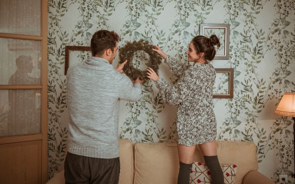
5. Fabric Gallery Wall Using Scarves or Prints
A fabric gallery wall using scarves, shawls, or printed textiles is one of the most practical ways to add color, texture, and personal storytelling to a blank wall. Instead of using only paper art, textile pieces create a softer and more layered display that can also be updated seasonally.
This layout works especially well in:
- hallway walls
- staircase walls
- bedroom dresser walls
- dining room sideboards
- home office backdrops
- entryway feature walls
Why This Layout Is Useful
A gallery wall often looks flat when every frame uses paper prints. Fabric introduces weave, folds, and tactile contrast.
This layout is useful because it:
- adds depth to gallery walls
- uses sentimental textiles creatively
- works well with travel scarves and heirloom fabrics
- reduces visual hardness from glass frames
- allows seasonal changes
- supports color coordination with room textiles
This is especially useful for homes that want a more personal design layer.
Best Placement Rule
Useful layout options:
- 3 equal frames above a console
- vertical staircase frame flow
- 2 large symmetrical textile frames
- mixed gallery with 1 fabric panel + 2 art prints
Spacing guide:
- keep 2–3 inches between frames
- align the centerline with eye level
- match overall width to 60–70% of furniture below
This keeps the gallery balanced.
Best Fabric Choices
Best useful textile options:
- silk scarves
- handloom dupattas
- block-print cotton
- embroidered shawls
- woven travel textiles
- ikat fabric
- vintage patterned linen
Choose fabrics with visible weave or embroidery.
Practical Styling Tip
Balance the softness of textile frames with harder surrounding materials.
Best pairings:
- black metal frames
- wood console below
- ceramic vase
- mirror nearby
- brass wall light
- matte wall paint
This creates better contrast.
Useful Seasonal Tip
This layout is easy to refresh.
Useful swaps:
- festive textiles
- travel scarves
- handmade fabrics
- warmer winter weaves
- light summer linens
This keeps the wall relevant without redesigning it.
Mistake to Avoid
Avoid mixing too many unrelated patterns in one gallery.
This can make the wall feel chaotic.
Instead:
- keep one color family
- repeat one frame finish
- mix solids with one patterned textile
- leave visible negative space
A fabric gallery wall is highly useful because it combines personal textile storytelling, soft texture, and structured wall styling in one flexible display system.
6. Neutral Linen Wall Hanging for Minimal Homes
A neutral linen wall hanging is one of the most effective ways to add texture to a minimal home without disturbing the clean look of the space. Linen naturally brings soft folds, subtle weave detail, and calm movement, making blank walls feel warmer while still staying understated.
This layout works especially well in:
- Scandinavian homes
- Japandi interiors
- minimal living rooms
- quiet bedroom walls
- dining room sideboards
- reading nooks
Why This Layout Is Useful
Minimal interiors often rely on fewer objects, so every wall piece needs to add depth without creating visual noise.
This layout is useful because it:
- adds texture without heavy patterns
- softens plain painted walls
- works with neutral palettes
- creates calm vertical movement
- pairs well with natural wood
- keeps the room visually light
This is especially practical in smaller homes where too much wall décor can feel busy.
Best Placement Rule
The most useful placement is on large blank walls that need softness instead of visual drama.
Useful size guide:
- above a sofa → 2/3 of sofa width
- above a console → slightly narrower than the furniture
- bedroom wall → centered to headboard width
- reading nook → tall vertical hanging for height
Hang the linen so the bottom falls naturally with slight folds.
Best Linen Choices
Best useful options:
- raw linen
- stone-washed linen
- off-white woven linen
- oatmeal beige linen
- greige linen blends
- lightly pleated linen panels
Choose visible weave over shiny finishes.
Practical Styling Tip
Linen works best when paired with warm natural materials.
Best pairings:
- oak furniture
- cane chairs
- boucle cushions
- ceramic vases
- matte black lighting
- wool rugs
This keeps the wall connected to the room palette.
Lighting Tip
Use side lighting or natural daylight.
This helps:
- show linen folds
- highlight weave softness
- create soft shadow movement
- improve the depth of neutral walls
The texture becomes more noticeable as light moves across it.
Mistake to Avoid
Avoid overly crisp or bright white linen in warm earthy interiors.
This can feel too stark.
Instead:
- use beige
- ivory
- sand
- taupe
- muted stone tones
A neutral linen wall hanging is highly useful because it adds soft depth, movement, and warmth while preserving the calm simplicity of minimal interiors.
7. Textured Jute or Cane Wall Decor
Textured jute or cane wall décor is one of the most practical ways to bring organic texture, earthy warmth, and handcrafted depth to a blank wall. These natural materials add strong tactile contrast while still feeling light and breathable, which makes them ideal for homes that need warmth without visual heaviness.
This layout works especially well in:
- living room feature walls
- dining room corners
- entryways
- hallway consoles
- balcony seating walls
- rustic and tropical interiors
Why This Layout Is Useful
Walls often need texture that feels natural rather than polished. Jute and cane solve this by introducing visible weave and handcrafted patterns.
This layout is useful because it:
- adds earthy warmth
- introduces strong woven texture
- pairs well with wood and plants
- supports rustic and organic styles
- keeps walls visually breathable
- works well in warm climates
This is especially practical in homes with neutral paint and wooden furniture.
Best Placement Rule
Useful placement options:
- single oversized round cane panel above a console
- set of 3 jute baskets on a hallway wall
- vertical cane panel near a dining sideboard
- entryway statement wall centered above a bench
Size guide:
- keep the overall arrangement within 60–70% of furniture width
- for grouped pieces, leave 3–4 inches spacing
- use round pieces to soften sharp furniture lines
This keeps the layout balanced.
Best Material Choices
Best useful options:
- handwoven jute discs
- cane mesh panels
- bamboo-rim woven pieces
- rattan wall plates
- braided natural fiber circles
- mixed jute + cotton woven décor
Choose natural matte finishes over lacquered glossy pieces.
Practical Styling Tip
These textures work best with layered natural materials nearby.
Best pairings:
- wooden console
- terracotta vase
- indoor plant
- linen runner
- stone bowl
- warm wall sconces
This creates a rich organic wall story.
Climate and Maintenance Tip
This is highly useful for users.
Jute and cane perform best in:
- dry walls
- well-ventilated rooms
- indirect sunlight
Avoid placing them in:
- damp bathrooms
- steam-heavy kitchens
- direct AC moisture zones
This helps prevent warping and mildew.
Mistake to Avoid
Avoid mixing jute or cane with too many synthetic glossy décor pieces.
This weakens the organic effect.
Instead:
- repeat natural textures
- use matte ceramics
- keep earthy neutral colors
- pair with greenery
Textured jute or cane wall décor is highly useful because it adds organic warmth, breathable texture, and handcrafted depth without overwhelming the wall.
8. Hallway Fabric Runner Wall Display
A hallway fabric runner wall display is one of the smartest ways to add vertical texture and movement to narrow spaces that usually feel flat. Because hallways often have long empty walls with limited furniture, a textile runner helps introduce softness without reducing walking space.
This layout works especially well in:
- narrow hallways
- staircase landings
- corridor end walls
- apartment passages
- entry hall transitions
- slim console walls
Why This Layout Is Useful
Hallways need décor that works vertically rather than horizontally.
This layout is useful because it:
- uses narrow wall space efficiently
- adds softness to transitional zones
- creates visual movement through length
- draws the eye upward in tight spaces
- reduces the tunnel-like feel
- works without adding shelves or furniture
This is especially practical in apartments with long passage walls.
Best Placement Rule
The most effective placement is vertical and centered.
Useful size guide:
- width should stay narrower than 1/3 of wall width
- use long vertical drop for height
- bottom edge should stay clear of floor cleaning zones
- center the runner with console width if furniture is below
This keeps the hallway open and elegant.
Best Fabric Choices
Best useful textiles:
- woven cotton runner
- block-print fabric strip
- handloom shawl display
- embroidered runner textile
- narrow jute weave
- soft linen vertical panel
Choose fabrics with visible texture rather than overly busy prints.
Practical Styling Tip
Use the runner to visually guide the movement path.
Best pairings:
- slim console table
- mirror on adjacent wall
- warm wall sconce
- narrow bench
- indoor plant at hallway end
This improves the flow of the space.
Lighting Tip
Hallway fabric displays need directional light.
Best options:
- wall sconces
- picture lights
- warm overhead spotlights
- natural light from end windows
This highlights the fabric texture and prevents the wall from looking flat.
Mistake to Avoid
Avoid very wide textile panels in narrow corridors.
This can make the hallway feel tighter.
Instead:
- keep the fabric vertical
- use lighter neutral tones
- maintain clean wall margins
- avoid fringe touching traffic zones
A hallway fabric runner wall display is highly useful because it adds height, movement, and soft texture to one of the most overlooked wall zones in the home.
9. Layered Mixed-Material Wall Decor
Layered mixed-material wall décor is one of the most premium ways to elevate a blank wall because it combines fabric texture with hard contrasting surfaces like wood, metal, cane, mirrors, or stone. This layered contrast makes the wall feel more custom-designed and visually rich than using only one material.
This layout works especially well in:
- living room feature walls
- dining room sideboards
- luxury bedrooms
- home office backdrops
- entryway consoles
- staircase feature walls
Why This Layout Is Useful
A single material can sometimes feel flat, even when textured. Mixing materials creates more depth and contrast.
This layout is useful because it:
- adds multiple texture layers
- creates premium contrast
- balances soft and hard surfaces
- works in modern luxury interiors
- supports large focal walls
- makes the wall feel custom styled
This is especially useful for homes with neutral palettes that need richness.
Best Material Combinations
Best useful pairings:
- linen + oak wood
- velvet + brass
- jute + black metal
- woven cotton + mirror
- fabric panel + cane insert
- wool textile + marble shelf
The key is using one soft texture and one structured material.
Best Placement Rule
Useful layout ideas:
- center fabric panel + side brass sconces
- woven textile above wood console + mirror
- fabric runner layered beside round cane panel
- linen art with slim floating shelf below
Keep the full arrangement within 60–70% of furniture width.
This keeps the wall cohesive.
Practical Styling Tip
Use layering from back to front.
A strong useful formula:
- back layer: large textile panel
- middle layer: wood frame or mirror
- front layer: console décor or plant
This creates real depth rather than only visual print.
Best Rooms for This Style
This works best in spaces with existing texture contrast:
- boucle sofa living rooms
- wood-heavy dining rooms
- velvet bedroom schemes
- brass lighting walls
- stone console entryways
The wall should connect with existing room finishes.
Mistake to Avoid
Avoid mixing too many competing finishes.
For example:
- jute + chrome + neon art + glossy marble
This breaks the design flow.
Instead:
- stay within 2–3 materials max
- repeat one finish
- use tonal neutrals
- keep one hero texture
Layered mixed-material wall décor is highly useful because it creates high-end depth, strong material contrast, and a custom interior-design look with very little floor impact.
10. Velvet Acoustic Panels for Home Office
Velvet acoustic panels are one of the most practical ways to improve a home office wall because they combine luxury texture with real sound control. They help the workspace look more premium while reducing echo, making video calls, recordings, and focused work more comfortable.
This layout works especially well in:
- desk backdrop walls
- video call backgrounds
- podcast corners
- study rooms
- compact workstations
- client-facing office setups
Why This Layout Is Useful
Home offices often have hard surfaces like desks, screens, tiled floors, and painted walls. These can create echo and make the space feel cold.
This layout is useful because it:
- improves sound absorption
- creates a professional call background
- adds premium texture behind the desk
- reduces harsh wall reflections
- supports better focus
- works well in compact work zones
This is especially practical for remote workers and creators.
Best Placement Rule
The most effective placement is on the wall directly behind or beside the desk.
Useful layout options:
- 3 vertical panels centered behind the chair
- grid of square panels behind monitor wall
- half wall acoustic strip beside desk
- full backdrop panel for video calls
Size guide:
- keep the panel zone within desk width or slightly wider
- panel height should align with camera frame level
- leave clean wall margins around the setup
This keeps the wall visually professional.
Best Velvet Choices
Best useful fabric options:
- matte velvet
- suede velvet blend
- deep neutral acoustic felt velvet
- ribbed velvet texture
- quilted velvet panel finish
Best colors:
- taupe
- olive
- warm grey
- charcoal
- muted navy
- beige
These colors reduce visual distraction.
Practical Styling Tip
Velvet acoustic panels look best with structured office materials.
Best pairings:
- walnut desk
- black monitor setup
- brass task lamp
- leather desk mat
- bookshelf side wall
- neutral curtains
This creates a luxury executive feel.
Sound Placement Tip
For better acoustic performance:
- place panels near monitor reflection points
- add one side-wall panel if the room echoes
- use thicker panels for tiled floors
- combine with curtains for larger rooms
This improves real usability.
Mistake to Avoid
Avoid bright velvet colors in video-call backgrounds.
This can pull focus away from the speaker.
Instead:
- use muted neutrals
- keep the backdrop clean
- use symmetrical panel layouts
- avoid cluttered shelf décor nearby
Velvet acoustic panels are highly useful because they improve sound comfort, work focus, and premium wall styling in one highly functional office solution.
Best Rooms to Use Fabric & Textured Wall Decor
Fabric and textured wall décor works best in rooms where the wall needs warmth, softness, acoustic comfort, or visual depth. The right room placement helps the texture feel intentional rather than decorative for the sake of filling space.
1) Living Room
The living room is one of the best places for fabric wall décor because it usually has large blank focal walls.
Best placements:
- above the sofa
- TV side walls
- fireplace wall
- reading corner wall
- dining-facing lounge wall
Best useful textures:
- woven tapestries
- linen panels
- jute wall discs
- framed textile art
This helps soften large hard wall surfaces.
2) Bedroom
Bedrooms benefit the most from soft wall materials because they support rest and reduce visual sharpness.
Best placements:
- behind the bed
- above the headboard
- dresser wall
- reading nook
- vanity side wall
Best useful textures:
- macramé
- upholstered panels
- velvet panels
- linen hangings
This improves calmness and acoustic softness.
3) Home Office
Fabric texture is highly practical in workspaces because it improves sound and makes video backgrounds more professional.
Best placements:
- behind the desk
- side reflection wall
- call background wall
- podcast corner
Best useful textures:
- velvet acoustic panels
- wool weave
- framed textile art
- linen panels
This improves both productivity and sound comfort.
4) Hallway and Entryway
These spaces are often flat and overlooked.
Best placements:
- end corridor wall
- vertical hallway runner display
- console wall
- staircase landing
Best useful textures:
- narrow textile runners
- jute circles
- cane wall plates
- vertical fabric panels
This adds movement and depth to transition spaces.
5) Dining Room
Dining areas often have hard surfaces that benefit from softness.
Best placements:
- sideboard wall
- buffet wall
- wall facing dining table
- bar cart wall
Best useful textures:
- framed textile panels
- woven cotton art
- linen hanging
- cane and jute layering
This reduces the cold feel of dining walls.
6) Reading Nook or Balcony Corner
Smaller lifestyle corners benefit from fabric texture because it enhances comfort.
Best placements:
- beside lounge chair
- tea corner wall
- balcony side wall
- corner seating zone
Best useful textures:
- macramé
- jute weave
- neutral linen
- woven wall baskets
This makes the space feel intentional.
7) Guest Room
Guest rooms often need warmth without excessive furniture.
Best placements:
- bed wall
- dresser wall
- side chair wall
Best useful textures:
- linen panels
- small tapestry
- upholstered feature panel
This helps the room feel finished and welcoming.
The best rooms for fabric and textured wall décor are spaces where the wall can improve comfort, softness, and material richness while supporting the room’s function.
Fabric Wall Styling Rules
Fabric wall décor looks most effective when the styling follows a few practical rules. Because fabric adds softness and texture, it needs the right scale, spacing, material balance, and lighting to avoid looking messy or heavy.
1) Match the Width to Furniture Below
Fabric décor should visually connect with nearby furniture.
Useful size guide:
- above sofa → around 2/3 of sofa width
- above bed → align with headboard width
- above console → slightly narrower than the furniture
- office backdrop → match desk width
This keeps the wall grounded.
2) Balance Soft Textures with Hard Materials
Too much fabric alone can make the wall feel flat.
Best pairings:
- linen + oak wood
- velvet + brass
- macramé + black metal
- jute + stone
- tapestry + mirror
This contrast adds structure.
3) Use Warm Directional Lighting
Texture becomes visible only when light creates soft shadows.
Best lighting sources:
- wall sconces
- bedside lamps
- side table lamps
- warm picture lights
- natural window light from the side
This highlights folds, knots, and woven depth.
4) Keep Surrounding Wall Décor Minimal
Fabric pieces already create visual movement.
Useful rule:
- one large textile piece = keep nearby art limited
- one textile gallery = repeat frame finish
- large tapestry = simple side lamps only
This prevents visual competition.
5) Repeat One Tone from the Room
The fabric should connect with nearby colors.
Best tone repetition:
- rug color
- curtain tone
- bedding shade
- sofa cushions
- wood finish
- brass accent
This makes the wall feel integrated.
6) Maintain Breathing Space Around the Textile
Texture needs negative space to stand out.
Leave visible space:
- at the top edge
- side margins
- around sconces
- between grouped textile frames
This keeps the wall elegant.
7) Choose the Right Texture Intensity
Heavy texture works best on large walls, while lighter texture suits smaller spaces.
Useful guide:
- small rooms → linen, cotton, slim weave
- large walls → tapestry, velvet panels, layered jute
- offices → acoustic velvet or wool
This keeps the wall balanced.
8) Keep Functional Zones Clear
Textiles should not interfere with movement or use.
Avoid:
- fringe touching sofa cushions
- hallway runners too close to floor
- office panels blocking shelves
- bathroom fabric near wet zones
This improves durability and usability.
Fabric wall styling works best when it combines proportion, material contrast, warm lighting, and clean negative space.
Common Mistakes to Avoid
Fabric and textured wall décor can transform a plain wall beautifully, but a few common mistakes can make the space feel cluttered, dusty, or visually heavy. Avoiding these issues helps the wall stay practical, elegant, and easy to maintain.
1) Choosing the Wrong Scale
A textile piece that is too small can get lost on a large wall, while one that is too large can overwhelm the room.
Useful fix:
- above sofa → use around 2/3 of sofa width
- hallway → choose tall vertical runners
- bedside → align with headboard width
- entryway → match console width
This keeps the fabric visually connected to the furniture.
2) Using Too Many Competing Patterns
Multiple strong prints, knots, and textures on the same wall can make it feel chaotic.
Examples:
- patterned scarf + busy wallpaper + printed cushions
- jute + bold ikat + colorful macramé
- velvet panel + loud geometric rug
Useful fix:
- keep one hero pattern
- use solids around it
- repeat one neutral tone
- balance with plain walls
This helps the texture stand out.
3) Ignoring Lighting
Texture loses its impact when the wall is poorly lit.
Problem:
- flat overhead light hides weave depth
- dark corners make fabric look dull
- shadowless lighting removes texture detail
Useful fix:
- use warm sconces
- add side table lamps
- use directional spotlights
- position near side natural light
This makes folds and woven surfaces visible.
4) Using Delicate Fabric in Humid Areas
Some fabrics can trap moisture and dust.
Avoid using:
- wool
- velvet
- untreated linen
in: - damp bathrooms
- steam-heavy kitchens
- non-ventilated walls
Useful fix:
- use treated cotton
- synthetic acoustic fabric
- wipeable upholstered tiles
This improves durability.
5) Overcrowding the Wall
Too many textile pieces can remove the softness effect.
Problems:
- no focal point
- difficult cleaning
- visually heavy wall
- design feels random
Useful fix:
- choose one oversized textile
- use symmetrical framed panels
- leave negative space
- limit grouped pieces to 3
This keeps the wall calm.
6) Poor Hanging Height
Hanging fabric too high disconnects it from the furniture below.
Useful fix:
- above sofa or bed → 6–8 inches above
- hallway runner → centered vertically
- gallery textile frames → eye level
Proper height improves cohesion.
7) Mixing Unrelated Materials
Fabric texture should support nearby finishes.
Avoid:
- rustic jute with chrome glam furniture
- velvet panels beside tropical cane
- linen art with neon acrylic décor
Useful fix:
- stay within 2–3 complementary materials
- repeat wood, brass, or black accents
- keep one texture family
Avoiding these mistakes helps fabric wall décor improve warmth, texture, and usability without making the wall feel overwhelming.
Luxury Styling Tips
Fabric and textured wall décor feels more elevated when the styling focuses on premium materials, restrained layering, warm lighting, and intentional contrast. Luxury wall styling is less about adding more pieces and more about choosing fewer, richer textures with strong placement.
1) Use High-End Fabric Contrast
Luxury walls work best when soft textures contrast with refined finishes.
Best combinations:
- velvet + brass sconces
- linen + walnut wood
- boucle + matte black metal
- wool weave + smoked glass
- jute + stone console
This creates strong visual richness.
2) Go Oversized Instead of Multiple Small Pieces
One large textile piece looks more premium than many scattered items.
Best choices:
- oversized tapestry above sofa
- full-height upholstered panels
- large framed linen art
- tall hallway runner textile
This gives the wall a custom-designed feel.
3) Add Warm Layered Lighting
Light makes texture feel expensive.
Best lighting:
- wall sconces beside textile panels
- under-picture warm glow
- warm bedside pendant near fabric wall
- hidden LED behind upholstered panels
Warm light helps reveal folds, knots, and woven depth.
4) Use Tonal Neutral Palettes
Luxury fabric walls usually feel calmer with layered neutrals.
Best shades:
- ivory
- taupe
- greige
- muted olive
- warm grey
- stone beige
Tonal neutrals create depth without visual noise.
5) Pair with Premium Hard Materials
Texture feels more elevated when it sits beside rich structured materials.
Best pairings:
- brass
- walnut
- marble
- black steel
- cane
- mirror accents
- smoked glass
This prevents the wall from feeling too soft.
6) Use Symmetry Around Key Furniture
Luxury styling becomes stronger when the fabric is balanced around furniture.
Useful layouts:
- symmetrical panels behind bed
- equal textile frames above sideboard
- centered tapestry above sofa
- matching sconces beside upholstered wall
This creates architectural balance.
7) Keep Edges Clean and Uncluttered
Luxury wall décor needs breathing room.
Keep clear:
- side wall margins
- top edge spacing
- console surface below
- nearby shelf clutter
The empty space makes the fabric feel more intentional.
8) Add Texture Layering Across the Room
The wall should connect with other soft surfaces.
Best pairings:
- linen curtains
- velvet cushions
- boucle chair
- wool rug
- upholstered bench
This creates a complete luxury texture story.
Luxury fabric wall styling works best when it combines oversized statement textures, warm light, rich contrast materials, and disciplined negative space.
Conclusion
Fabric and textured wall décor is one of the most effective ways to turn plain walls into warm, layered, and functional design features. Unlike flat wall art, textiles add depth, softness, acoustic comfort, and tactile richness, making the room feel more complete without adding bulky furniture.
The most practical approach is to match the texture to the room’s purpose:
- living room → oversized tapestry, framed textile art, jute or cane layering
- bedroom → macramé, upholstered panels, linen hangings
- home office → velvet acoustic panels, wool weave, clean framed textiles
- hallway → vertical runners and narrow woven panels
- dining room → textile panels with warm side lighting
For the best results, follow a few key rules:
- match width to nearby furniture
- use warm directional lighting
- balance fabric with wood, brass, stone, or mirrors
- keep enough negative space
- avoid too many competing patterns
- choose materials suited to the room’s humidity and use
For a more elevated look, focus on oversized statement textiles, tonal neutral palettes, premium materials, and symmetrical layouts.
When chosen well, fabric wall décor does more than decorate a wall—it improves comfort, acoustics, warmth, and the overall sense of luxury in the room.