Blank walls can make a minimal home feel unfinished, but filling them the wrong way can quickly make the space look busy. A well-planned gallery wall solves this problem by adding personality, visual structure, and focus without disturbing the clean look of the room.
In minimal homes, every décor element needs a purpose. A gallery wall works best when it follows the same principle—intentional placement, consistent frames, and a limited color palette. Instead of randomly hanging art, the goal is to create a layout that supports the room’s design and improves the overall balance.
Modern gallery walls are especially useful for spaces that need a focal point, such as:
- the wall above a sofa
- the wall behind a bed
- hallways
- entryways
- home office corners
They also help define zones in open-plan apartments where furniture alone may not create enough visual separation.
The key is to keep the arrangement simple. Slim frames, neutral artwork, black-and-white photography, line art, or one-tone abstract prints usually work best in minimal interiors. Proper spacing between frames is equally important because negative space helps the wall feel clean instead of crowded.
In this guide, you’ll learn 10 practical modern gallery wall ideas for minimal homes that are easy to apply in living rooms, bedrooms, hallways, and small apartment spaces.
Why Gallery Walls Work in Minimal Homes
A gallery wall can add interest to a minimal home without taking away from its clean and calm feel. The reason it works so well is simple: it adds structure, personality, and focus while still respecting the principle of “less, but better.”
1) They Add Personality Without Clutter
Minimal homes often rely on neutral colors, simple furniture, and open surfaces. While this creates a peaceful look, it can sometimes make walls feel empty or unfinished.
A gallery wall solves this by adding visual interest in a controlled way. Instead of using many decorative objects around the room, a single curated wall can carry the personality of the space through artwork, photography, or simple line prints.
The key is to limit the number of pieces and keep a consistent style.
2) They Create a Strong Focal Point
Every room benefits from having one clear visual anchor. In minimal interiors, a gallery wall can become that focal point.
It works especially well:
- above a sofa
- above a bed
- behind a dining bench
- along a hallway
- near an entry console
This helps guide the eye and gives the room a finished, intentional look.
3) They Support a Clean Design Language
Minimal design depends on balance, symmetry, and breathing space. Gallery walls naturally support this when frames are aligned properly and spacing is kept even.
Using slim black, white, or oak frames helps the wall blend into the room instead of overpowering it. Neutral art styles like monochrome photography, abstract line art, and muted sketches keep the look cohesive.
4) They Are Easy to Update
One practical advantage of gallery walls is flexibility. You can refresh the look of the room without changing furniture or repainting walls.
Swapping:
- seasonal prints
- travel photos
- typography quotes
- abstract art
can give the room a fresh look while keeping the same frame layout. This makes gallery walls a long-term and cost-effective décor solution for minimal homes.
1. Perfect Grid Layout
A perfect grid layout is one of the most reliable gallery wall styles for minimal homes because it creates order, symmetry, and visual calm. The frames are arranged in straight rows and columns with equal spacing, which naturally supports a clean and uncluttered interior.
This layout works best when you use:
- the same frame size
- identical frame color
- equal spacing between each piece
- artwork with a similar tone or theme
For example, a 2×3 or 3×3 frame grid above a sofa or console table can instantly make the wall feel intentional and finished.
Where It Works Best
The grid layout is especially useful in:
- living rooms above the sofa
- dining walls
- hallways
- home office walls
- staircase landings
Because the structure is predictable, it helps create balance in spaces that already have simple furniture and straight lines.
Best Art Choices for a Minimal Grid
To keep the wall modern and minimal, use artwork that feels cohesive.
Useful options include:
- black-and-white photography
- line art
- botanical sketches
- abstract neutral prints
- architecture photos
The content of the frames should feel connected so the wall reads as one composition instead of separate random pieces.
Practical Spacing Rule
Leave 2 to 3 inches of equal space between each frame. Consistent spacing is what makes this layout look polished.
Before hanging, place the frames on the floor first or use paper templates on the wall to test alignment. This prevents uneven placement and helps maintain symmetry.
A perfect grid layout is ideal for users who want a safe, elegant, and easy-to-plan gallery wall that works beautifully in modern minimal homes.
2. Black-and-White Photography Wall
A black-and-white photography gallery wall is one of the most practical choices for minimal homes because it keeps the wall visually clean while adding depth and character. The limited color palette makes it easy to style with neutral interiors, and the photographs bring personality without making the room feel busy.
This layout works well because black-and-white images naturally create contrast. The dark and light tones stand out against plain walls, especially white, beige, or soft grey backgrounds, which are common in minimal interiors.
Best Photo Themes to Use
To keep the wall intentional, choose one theme instead of mixing unrelated images.
Useful themes include:
- architecture photography
- travel street scenes
- landscapes
- family portraits
- nature close-ups
- city skylines
Using a single theme helps the gallery wall feel more curated and less random.
Frame Style That Works Best
For a modern minimal look, keep the frames simple.
Best options:
- matte black slim frames
- white thin frames
- light oak frames
- narrow metal borders
Avoid bulky decorative frames because they can make the arrangement feel heavy.
Ideal Placement Areas
This style works especially well in:
- living rooms above a sofa
- bedroom walls above the headboard
- hallway walls
- home office corners
- staircase walls
It is also a great choice for rental apartments because the monochrome style works with almost any furniture palette.
Useful Styling Tip
Use the same editing style for all photos. Similar contrast and brightness levels help the wall look consistent.
If you want a more modern result, mix:
- 2 larger anchor frames
- 4–6 smaller supporting frames
This creates balance while still keeping the minimal aesthetic intact.
3. Abstract Line Art Arrangement
An abstract line art gallery wall is one of the easiest ways to decorate a minimal home because it keeps the wall visually light while adding design interest. The simple shapes, clean strokes, and neutral tones fit naturally into modern interiors without overwhelming the space.
This style works especially well in homes that follow:
- Scandinavian design
- Japandi interiors
- modern minimal décor
- neutral apartment styling
Because line art uses open space and simple forms, it supports the calm and uncluttered look that minimal homes need.
Best Art Style to Choose
To keep the arrangement cohesive, select prints that follow a similar visual language.
Useful choices include:
- face line drawings
- abstract curves
- botanical outlines
- geometric shapes
- one-line body sketches
- soft neutral brush forms
Try to stay within a black, beige, taupe, or charcoal palette so the wall blends smoothly with the room.
Where This Layout Works Best
Abstract line art works best in spaces where the wall should feel soft and elegant.
Best placement areas:
- above the bed
- above a reading chair
- hallway walls
- dining corners
- home office walls
It is especially useful in bedrooms because the artwork feels calm and non-distracting.
Best Layout Style
This art style looks best in:
- a 3-frame horizontal row
- a vertical stack of 2–4 frames
- a balanced asymmetrical layout
- a shelf-based leaning arrangement
The layout should leave enough breathing space so the simplicity of the art remains the focus.
Useful Styling Tip
Pair line art with:
- slim black frames for contrast
- oak frames for warmth
- white frames for a softer blend
Keep the mat board white or off-white to preserve the clean minimal effect. This small detail makes the wall look more refined and intentional.
4. Shelf-Based Gallery Wall
A shelf-based gallery wall is one of the most practical options for minimal homes because it gives you flexibility without permanent commitment. Instead of hanging every frame directly on the wall, you place artwork on floating shelves or picture ledges and lean the frames against the wall.
This method keeps the arrangement clean, modern, and easy to update. It is especially useful for renters or anyone who likes to refresh their décor regularly.
Why It Works Well in Minimal Homes
Minimal interiors benefit from layouts that feel organized and easy to maintain. A shelf-based gallery wall allows you to create a styled display while keeping everything aligned on one horizontal line.
It also helps reduce visual clutter because:
- the shelf creates a clear boundary
- frames stay grounded in one area
- spacing is easier to control
- the wall looks structured
This makes it ideal for modern apartments and compact spaces.
Best Shelf Styling Elements
To keep the shelf visually balanced, combine frames with a few functional decorative accents.
Useful additions:
- small ceramic vases
- candles
- a trailing plant
- one stacked book
- a small sculptural object
The key is to keep décor minimal and avoid overcrowding the ledge.
Best Places to Use It
This style works especially well in:
- living rooms above the sofa
- home office walls
- hallway consoles
- bedroom side walls
- dining bench areas
A long floating ledge above a sofa creates a strong focal point without needing multiple wall holes.
Practical Styling Rule
Use 2–4 overlapping frames of different heights but keep the frame color consistent.
For example:
- one large anchor frame in the back
- two medium frames in front
- one small accent print on the side
This layering creates depth while still keeping the wall modern and minimal.
A shelf-based gallery wall is one of the easiest layouts to maintain because you can swap art, photos, or seasonal prints anytime without redesigning the whole wall.
5. Oversized Centerpiece with Supporting Frames
This gallery wall style works well in minimal homes because it creates a clear focal point without filling the entire wall. Instead of using many small frames, the layout starts with one oversized artwork in the center and a few smaller frames placed around it for balance.
The large centerpiece anchors the wall, while the supporting frames add structure and detail. This keeps the arrangement intentional and spacious.
Why This Layout Is Useful
Many people struggle with gallery walls because too many small frames can make the wall feel cluttered. This layout solves that problem by reducing the number of elements.
It is especially useful when:
- the wall is medium-sized
- you want a statement look
- the room already has minimal furniture
- the décor palette is neutral
- you want easy visual balance
The oversized piece does most of the work, so the supporting frames only need to complement it.
Best Artwork Combination
A useful combination is:
- 1 large central artwork
- 2 small vertical side frames
- 1 horizontal frame below or beside
- optional small mirror accent
This creates balance without making the wall feel heavy.
Best art choices:
- abstract neutral canvas
- oversized line art
- architectural photography
- monochrome portrait
- soft textured print
Best Places to Use This Layout
This arrangement works especially well:
- above a sofa
- above a bed
- behind a dining bench
- entryway focal wall
- office desk wall
It is highly effective in rooms where one wall needs more presence but the rest of the room stays simple.
Practical Spacing Tip
Keep 4–6 inches of breathing space around the oversized frame so it remains the hero piece.
The smaller supporting frames should stay aligned either to the top edge or centerline of the large artwork. This keeps the layout balanced and visually calm.
This is one of the most useful gallery wall styles for users who want a modern statement wall with minimal visual noise.
6. Vertical Gallery Wall for Narrow Spaces
A vertical gallery wall is one of the most useful layouts for minimal homes with narrow or awkward wall areas. Instead of spreading frames horizontally, the artwork is stacked upward in a straight or softly aligned vertical line. This helps draw the eye upward and makes the wall feel taller.
This layout is especially effective in small homes because it uses wall height instead of width, which is often underused.
Where This Layout Works Best
Vertical arrangements are ideal for spaces that are tall but narrow.
Best placement areas:
- hallways
- staircase walls
- entryway corners
- wall space between windows
- beside tall mirrors
- narrow bedroom walls
In these areas, horizontal gallery walls may feel too wide, while a vertical layout fits naturally.
Why It Helps Minimal Interiors
Minimal homes often have clean walls with limited décor. A vertical stack adds interest without spreading across too much visual space.
It is useful because it:
- keeps the wall structured
- uses negative space efficiently
- adds height to low ceilings
- works well with slim furniture
- suits narrow apartment layouts
This makes it a smart option for modern flats and compact homes.
Best Frame Arrangement
A practical layout is:
- 3 equal-size frames stacked vertically
- 1 large frame + 2 smaller ones
- mixed vertical rectangles
- line art sequence in matching frames
The artwork should follow one theme so the arrangement feels connected.
Useful themes:
- botanical sketches
- architecture photos
- travel story frames
- abstract neutral prints
- quote typography
Helpful Hanging Rule
Leave 2 to 3 inches between each frame and keep the centerline straight.
For staircase walls, align the frames with the angle of the stairs so the arrangement follows the movement of the space.
A vertical gallery wall is highly useful for users who want to decorate small narrow areas without breaking the calm and minimal look of the home.
7. Neutral Frame Mix Layout
A neutral frame mix layout is ideal for minimal homes because it adds variation without losing visual harmony. Instead of using the exact same frame everywhere, this style combines different frame sizes and finishes within one neutral color family.
The result feels modern, layered, and more natural than a strict grid, while still keeping the wall calm and uncluttered.
Best Frame Colors to Use
The key to making this layout work is staying within a soft and consistent palette.
Useful frame options:
- matte black
- white
- light oak
- beige wood
- soft grey metal
- charcoal slim frames
These colors work well together because they don’t compete for attention.
Why This Layout Is Helpful
Many users want a gallery wall that feels more personal than a perfect grid. A neutral frame mix gives that flexibility while still looking polished.
It is useful because:
- different print sizes fit easily
- older frames can be reused
- the wall feels less rigid
- it supports collected minimal styling
- it works with both art and photography
This is especially practical for people styling with prints gathered over time.
Best Art Pairing
To keep the wall cohesive, pair the neutral frames with artwork in soft tones.
Best choices:
- black-and-white photos
- beige abstract prints
- soft charcoal sketches
- botanical line drawings
- typography art
- muted travel photos
The art should share a similar mood even if the frame sizes vary.
Best Placement Areas
This layout works especially well:
- above a sofa
- hallway walls
- reading corners
- home office walls
- bedroom side walls
It also works beautifully in open-plan apartments because it feels decorative without becoming the dominant feature.
Practical Styling Rule
Mix 2–3 frame sizes only to keep the layout controlled.
A good formula is:
- 1 large frame
- 2 medium frames
- 2 small accent frames
Arrange them with balanced spacing and allow enough negative space around the outer edges.
This layout is useful for users who want a modern gallery wall that feels softer and less formal than a grid while still fitting a minimal home.
8. Above Sofa Linear Layout
An above sofa linear layout is one of the most practical gallery wall styles for minimal living rooms. The frames are arranged in a clean horizontal line, making the wall feel organized and visually connected to the furniture below.
This layout works especially well in modern homes because the straight horizontal structure complements the clean lines of a sofa, console, or bench.
Why This Layout Works
The space above a sofa is often the main blank wall in a living room. A linear gallery wall helps define this area without making it feel heavy.
It is useful because it:
- creates a clear focal point
- keeps the wall balanced with the sofa width
- works well in small apartments
- supports modern minimal styling
- is easy to plan and hang
This is one of the safest layouts for users who want a polished result with minimal risk.
Best Frame Arrangement
A practical arrangement includes:
- 3 equal-size frames in one row
- 5 slim vertical frames
- 1 long panoramic print + 2 small side frames
- 4 mixed frames with equal top alignment
The total width of the arrangement should cover about two-thirds of the sofa width. This keeps the wall proportional.
Best Art Choices
Useful art styles for this layout:
- black-and-white city photos
- neutral abstract art
- typography prints
- architectural sketches
- soft landscape photography
- line art sets
Using a similar theme across all frames helps maintain the minimal aesthetic.
Practical Hanging Rule
Hang the frames 6 to 8 inches above the sofa backrest.
This keeps the gallery wall visually connected to the furniture and prevents it from looking too high.
Spacing between frames should remain equal, ideally 2 to 3 inches, so the arrangement reads as one composition.
This layout is highly useful for living rooms because it turns the sofa wall into a clean design feature while preserving the calm and balanced feel of a minimal home.
9. Minimal Corner Gallery Wall
A minimal corner gallery wall is a practical way to use small, overlooked areas that often remain empty. Instead of focusing only on large central walls, this layout helps bring purpose to corners such as reading nooks, workspaces, or the area beside a lounge chair.
In minimal homes, these small styled corners can make the room feel complete without adding extra furniture or bulky décor.
Where This Layout Works Best
This style is most useful in compact areas where a full gallery wall may feel too large.
Best placement spots:
- reading corners
- beside an accent chair
- home office desk corner
- bedroom vanity corner
- hallway bench corner
- window-side seating area
These corners often need just enough décor to feel intentional.
Why It Is Useful
Many users ignore corner walls, which can make the room look unfinished. A small gallery arrangement helps visually define the function of that space.
It is useful because it:
- adds focus to unused corners
- supports zoning in open rooms
- makes small spaces feel designed
- works with very few frames
- keeps the rest of the room visually open
This is especially effective in studio apartments where each corner serves a different purpose.
Best Frame Formula
A useful arrangement is:
- 1 medium anchor frame
- 2 small supporting frames
- optional slim mirror
- small floating shelf below
This creates enough visual interest without overpowering the area.
Best Art Choices
Choose art that supports the mood of the corner.
For example:
- calming line art for reading nooks
- motivational typography for office corners
- abstract neutral prints for lounge spaces
- botanical sketches near windows
Practical Styling Tip
Keep the arrangement compact and leave breathing space around it.
The goal is to make the corner feel styled, not crowded. If there is furniture below, align the gallery wall with the width of that furniture piece for better visual balance.
This layout is highly useful for users who want to make small corners feel purposeful and aesthetically complete in a minimal home.
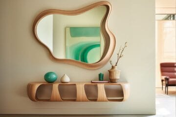
10. Mirror + Art Combination Gallery Wall
A mirror + art combination gallery wall is one of the most useful layouts for minimal homes because it combines visual depth with decorative interest. The mirror helps reflect light and make the room feel larger, while the artwork adds personality and structure.
This style is especially effective in small apartments or narrow rooms where the wall needs both function and design value.
Why This Layout Works Well
Using only frames can sometimes make a gallery wall feel flat. Adding a mirror introduces reflection, which breaks the repetition and gives the arrangement more dimension.
It is useful because it:
- reflects natural light
- makes small spaces feel wider
- adds contrast between art and reflection
- creates a softer visual rhythm
- works as both décor and function
This makes it a strong choice for minimal interiors where every element should serve a purpose.
Best Mirror Types to Use
The mirror should stay simple so it blends with the artwork.
Best options:
- round slim metal mirror
- arched mirror
- oval frameless mirror
- rectangular black border mirror
- soft brass thin-frame mirror
A round mirror works especially well because it breaks the straight lines of the surrounding frames.
Best Art Pairing
Useful artwork combinations:
- 2 abstract prints + 1 round mirror
- line art set around a central mirror
- black-and-white photography + oval mirror
- neutral botanical sketches + slim arch mirror
The art should stay within the same tone family to keep the wall cohesive.
Best Placement Areas
This layout works best:
- above an entry console
- in hallway walls
- above a bedroom dresser
- beside a dining nook
- small living room feature wall
It is especially helpful in entryways where users need both a decorative wall and a functional mirror.
Practical Styling Rule
Place the mirror either:
- at the center as the anchor piece
- slightly off-center in asymmetrical layouts
Keep 2–4 inches of spacing around all surrounding frames so the wall feels balanced.
This is one of the most user-friendly gallery wall styles because it improves light, space, and design impact at the same time.
How to Plan the Perfect Minimal Gallery Wall
A good gallery wall looks effortless, but the result depends on careful planning. In minimal homes, planning is even more important because uneven spacing, too many frames, or random art choices can quickly make the wall feel cluttered.
These practical steps help create a gallery wall that feels clean, balanced, and useful.
1) Start With the Wall Purpose
Before choosing frames, decide what the wall needs to do.
Ask:
- Is it the main focal point of the room?
- Does it need to make the wall feel taller?
- Is it for a hallway, sofa wall, or reading corner?
- Does it need a functional mirror too?
This helps you choose the right layout instead of forcing a design that doesn’t suit the space.
2) Choose One Visual Theme
Minimal walls work best when everything feels connected.
Useful theme ideas:
- black-and-white photography
- neutral abstract prints
- line art
- architecture images
- travel memories
- typography quotes
Pick one theme and keep it consistent across the wall.
3) Keep the Frame Style Consistent
Even if you mix sizes, the frame finish should feel related.
Best options:
- all matte black
- white slim frames
- oak wood tones
- neutral frame mix
This creates cohesion and prevents visual noise.
4) Test the Layout Before Hanging
This is one of the most useful steps.
Place the frames:
- on the floor first
- use paper cutouts on the wall
- mark the centerline
- check spacing visually
This helps avoid unnecessary wall holes and uneven placement.
5) Maintain Equal Spacing
Spacing is what makes a minimal gallery wall feel polished.
A safe rule:
- 2–3 inches between small to medium frames
- 4–6 inches around oversized anchor art
Keep the outer edges visually balanced.
6) Respect Negative Space
Do not fill the entire wall.
Leave empty space around the arrangement so the wall can breathe. Negative space is essential in minimal design because it helps the art stand out and keeps the room calm.
A well-planned gallery wall should feel like part of the room’s architecture, not something added randomly.
Common Mistakes to Avoid
Even a good gallery wall idea can lose its impact if the layout is not planned properly. In minimal homes, small mistakes become more visible because the design relies on balance, spacing, and visual calm.
Avoiding these common issues will help keep the wall clean, functional, and aligned with the minimal aesthetic.
1) Overcrowding the Wall
The most common mistake is adding too many frames.
When the wall is filled edge to edge, the arrangement loses focus and starts to feel cluttered. Minimal interiors need breathing space, so it’s better to use fewer pieces with proper spacing.
A useful rule is to stop once the wall has one clear focal composition.
2) Mixing Too Many Art Styles
Combining line art, colorful abstracts, family photos, quotes, and vintage paintings in one small wall can make the design feel disconnected.
Choose one visual direction, such as:
- monochrome photography
- neutral abstract prints
- typography
- botanical sketches
A single style keeps the wall intentional.
3) Uneven Spacing Between Frames
In minimal gallery walls, uneven spacing is immediately noticeable.
Always maintain:
- 2–3 inches between standard frames
- consistent top or center alignment
- equal edge distance around the outer layout
Testing the layout first prevents this issue.
4) Hanging the Wall Too High
A gallery wall that sits too high loses its connection with the furniture below.
For sofa or bed walls, keep the arrangement:
- 6–8 inches above furniture
- centered to eye level where possible
This creates a stronger visual relationship with the room.
5) Using Bulky Decorative Frames
Heavy carved frames or ornate metallic borders can overpower a minimal interior.
Instead, choose:
- slim black frames
- white borders
- light oak finishes
- thin metal profiles
The goal is to support the art, not distract from it.
6) Ignoring Room Proportions
A small gallery wall on a very large sofa wall can look lost, while an oversized arrangement on a narrow hallway can feel cramped.
Always scale the layout to the wall and nearby furniture.
A useful guide:
- cover about two-thirds of furniture width
- keep narrow walls vertical
- use corner layouts for small zones
Avoiding these mistakes makes the gallery wall more useful, easier to live with, and visually stronger in a minimal home.
Best Color Palettes for Modern Minimal Gallery Walls
The color palette of a gallery wall has a major impact on how the room feels. In minimal homes, the right palette helps the wall blend naturally with the space instead of competing for attention.
A well-chosen palette keeps the arrangement calm, cohesive, and easy to style with existing furniture.
1) Black + White
This is the most timeless palette for modern gallery walls.
It works well because:
- strong contrast adds focus
- suits almost every wall color
- pairs easily with modern furniture
- works with photography and line art
Best for:
- living rooms
- hallways
- office walls
- above sofa layouts
2) Beige + Oak
This palette creates warmth while keeping the wall soft and minimal.
Use:
- beige abstract prints
- light taupe sketches
- cream backgrounds
- oak wood frames
This works especially well in:
- Scandinavian homes
- Japandi interiors
- cozy bedrooms
- reading corners
3) Soft Grey + Charcoal
A muted grey palette gives the wall a refined modern look.
Useful art styles:
- city architecture
- monochrome landscapes
- textured abstract forms
- charcoal sketches
This palette works beautifully in apartments with grey sofas, stone textures, or polished concrete finishes.
4) Muted Earth Tones
Earth tones keep the wall grounded and natural.
Useful shades:
- sand
- clay
- olive
- warm brown
- muted rust
- stone grey
These colors pair well with wood furniture, plants, and linen textures.
5) White + Taupe + Black Accent
This is one of the most practical palettes for minimal homes because it balances softness with structure.
Use:
- white mat boards
- taupe abstract prints
- black slim frames
- one darker anchor artwork
This creates enough contrast without making the wall feel heavy.
Useful Palette Rule
Stick to 2–3 core colors only across:
- frames
- artwork
- mat boards
- nearby furniture accents
This keeps the wall visually connected to the room and prevents random styling choices.
The best palette is the one that supports the mood of the room while maintaining simplicity. In minimal homes, color consistency is what makes a gallery wall feel elegant instead of busy.
Conclusion
A modern gallery wall can make a minimal home feel complete without adding unnecessary clutter. When planned with the right layout, consistent frames, and a controlled color palette, it becomes a functional design feature rather than just decoration.
The most effective approach is to choose a layout based on the wall’s purpose:
- use a grid layout for symmetry
- choose a linear layout above the sofa for living rooms
- use a vertical stack for narrow walls
- create a corner gallery wall for small unused spaces
- combine mirror + art where light and depth are needed
The key is to keep the arrangement intentional. Use artwork that follows one theme, maintain equal spacing, and leave enough negative space around the layout so the wall can breathe.
A well-designed gallery wall should improve the room by:
- creating a focal point
- defining a zone
- adding personality
- supporting the minimal style
- making blank walls feel purposeful
Start with one wall, test the layout before hanging, and keep the design simple. In minimal homes, thoughtful placement always works better than adding more pieces.