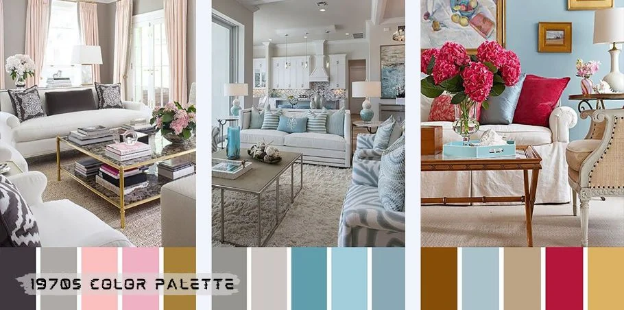
The 1970s was a decade marked by vibrant shifts in fashion, culture, and design. From shag carpets to psychedelic prints, the visual aesthetic of this time was unmistakable. Central to this aesthetic was the 1970s color palette, which featured a unique blend of earthy tones, bold accents, and subtle neutrals. These colors not only reflected the mood of the times but also influenced design trends in everything from interior décor to graphic design. In this article, we’ll explore the rich and nostalgic world of 1970s colors, uncovering why they were so iconic, how they were used, and why they’re making a comeback today.
The Influence of the 1970s Color Palette
The 1970s color palette wasn’t just a trend—it was a reflection of the broader social and cultural shifts happening at the time. The post-Vietnam era, the rise of environmental awareness, and the growing interest in self-expression all played a part in shaping the design choices of the decade. Colors like avocado green, burnt orange, and mustard yellow were not only fashionable but also symbolic of the era’s values: comfort, earthiness, and authenticity. Additionally, technological advances in dyes and printing techniques gave designers more options than ever before, allowing for the explosion of new color combinations that defined the look of the decade.
Key Characteristics of the 1970s Color Palette
One of the most defining features of the 1970s color palette was its reliance on earthy, natural tones. Think of colors you might find in nature: browns, greens, yellows, and oranges. These muted, grounded hues gave interiors and fashion a cozy, lived-in feel. But it wasn’t all soft and subdued—bold contrasts and unexpected color pairings added an element of surprise and energy to the palette. The 1970s was about embracing both the calm of earth tones and the excitement of striking accents.
Signature Colors of the 1970s
The 1970s saw a few colors dominate the scene, each with its own story and significance. These colors quickly became synonymous with the era:
- Avocado Green: This earthy, muted green was everywhere in the ’70s, from kitchen appliances to shag rugs. It evoked a connection to nature and a sense of groundedness.
- Burnt Orange: Bold and warm, burnt orange was a popular accent color in both fashion and interiors. It had an energetic, retro vibe that made a statement.
- Mustard Yellow: This rich, golden shade was a favorite in home décor and clothing. It added warmth and depth, often paired with brown or green.
- Brown: A cornerstone of the palette, brown was considered a versatile neutral that balanced out more vibrant hues. It added warmth and sophistication to any room.
- Harvest Gold: Like mustard yellow, this shade of gold was bright and warm, frequently seen in appliances and furniture during the decade.
The Role of Neutrals in the 1970s Palette
While the 1970s palette was dominated by rich, saturated colors, neutrals played a crucial role in anchoring the overall aesthetic. Shades like beige, taupe, and off-white were used to balance the bolder colors, creating a sense of harmony in interior design and fashion. Neutrals helped create a warm, inviting atmosphere that didn’t overwhelm the senses, allowing the vibrant colors to shine without clashing.
The 1970s in Interior Design
When it came to interior design, the 1970s color palette was everywhere. Avocado green was a popular choice for kitchen appliances, while burnt orange and mustard yellow adorned furniture and walls. The use of earthy tones in combination with bold patterns, like geometric prints and florals, created a dynamic visual language. Wood paneling, shag carpeting, and plush upholstery completed the look, making homes feel cozy and lived-in.
The 1970s in Fashion
Fashion in the 1970s was just as colorful as the home décor of the time. The iconic bell-bottom pants were often paired with mustard yellow tops, while brown leather jackets were worn over burnt orange shirts. These colors were not just seen on clothing—they were also present in accessories, like handbags, shoes, and hats, creating a coordinated, vibrant look that defined the decade’s fashion scene.
The 1970s in Graphic Design and Advertising
The color palette of the 1970s also made a big impact on graphic design and advertising. Brands like Coca-Cola and McDonald’s embraced bold colors to catch consumers’ attention, while posters and album covers used these rich hues to evoke the energy of the times. The combination of earthy tones with bold typography created an unmistakable aesthetic that still resonates in design today.
Psychological Effects of the 1970s Colors
The psychological impact of color cannot be understated, and the 1970s colors had a distinct effect on mood and atmosphere. Earthy tones like avocado green and burnt orange were known for creating a sense of warmth and comfort. These colors made spaces feel cozy, inviting, and grounded—qualities that were especially appreciated during a time of social upheaval and uncertainty.
Revival of the 1970s Color Palette in Modern Design
Today, the 1970s color palette is experiencing a resurgence in both fashion and interior design. Modern designers are embracing the warm, earthy tones of the past and incorporating them into contemporary spaces. Whether it’s through vintage-inspired furniture or color-blocking in fashion, the 1970s palette is making a comeback with a modern twist.
How to Use the 1970s Color Palette in Your Space
Incorporating 1970s colors into modern interiors can be a fun way to create a nostalgic yet fresh look. You don’t need to go overboard—just a few strategic accents in burnt orange, avocado green, or mustard yellow can add a retro flair without overwhelming the space. Combine these bold colors with neutral tones like beige or taupe to balance the vibrancy.
Challenges of Using 1970s Colors Today
While the 1970s color palette is beloved for its warmth and nostalgia, it can be tricky to use in modern design. One challenge is balancing these bold colors with contemporary styles. Additionally, some of the colors, like burnt orange and mustard yellow, can be overwhelming if used in excess. The key is moderation and pairing with more neutral tones for a harmonious result.

Popular 1970s Color Combinations
One of the reasons the 1970s color palette was so successful is because of how well the colors paired with each other. Some iconic combinations include:
- Mustard yellow with olive green: This pairing created a bold, earthy vibe that was popular in both fashion and home décor.
- Burnt orange with deep brown: The warm tones of these colors complemented each other beautifully, adding depth and richness to any space.
Case Studies of 1970s Color Usage
Many famous brands and buildings embraced the 1970s color palette. For example, the iconic Volkswagen Beetle was often seen in shades like mustard yellow or burnt orange, reflecting the era’s bold approach to color. Additionally, buildings from the era often featured combinations of warm tones, like terracotta and golden yellow, giving them a distinctive, retro feel.
FAQs About 1970s color palette
Why was avocado green so popular in the 1970s?
Avocado green symbolized a connection to nature and was seen as a comforting, earthy tone that was widely embraced in home décor and appliances during the 1970s.
How can I incorporate 1970s colors into my modern home?
You can start with small accents like throw pillows, rugs, or artwork in 1970s-inspired colors. Pair these with neutral tones to create a balanced, retro-modern look.
What are some classic color combinations from the 1970s?
Popular combinations include mustard yellow with olive green, burnt orange with deep brown, and avocado green with beige.
Did the 1970s color palette influence fashion as well as interior design?
Yes, the bold and earthy tones of the 1970s were prominent in fashion, with clothing items in shades like mustard yellow, burnt orange, and olive green being popular.
Are 1970s colors making a comeback today?
Absolutely! The 1970s color palette is experiencing a revival in both modern interiors an
Conclusion
The 1970s color palette remains one of the most iconic and enduring trends in design history. From earthy greens and browns to vibrant oranges and yellows, these colors reflected the optimism and warmth of the era. Today, these colors are making a comeback, reminding us of a time when design was bold, expressive, and full of life.


